学生のプロフィール情報とテスト結果の関係とは
- 2019.04.11
- Kaggle
気まぐれにKaggleのデータセットを眺めていたら面白そうなデータセットがあったのでサクッと分析してみました。
使ったデータセットは、「Students Performance in Exams」という学生のプロフィール情報(親の教育水準/人種/経済レベル/性別 etc)とテストの得点(数学/Writing/Reading)です。
Kaggleで紹介されているページはです。

また、出典となったデータセットのページは以下です。

分析に入る前の仮説として、経済的余裕があると家庭教師や塾に通えるので成績が良いとか、学生の間は男子よりも女子の方が賢い(どこかの記事で読んだ気がします。間違っていたらすいません。)とか、学生のプロフィール情報がテストの得点に及ぼす影響は何かしらあると思われます。
果たしてデータからそれがわかるのか実際に見ていきます。
準備
ライブラリとかデータを読み込みます。
# ライブラリ
import pandas as pd
import numpy as np
from matplotlib import pyplot as plt
import seaborn as sns
from sklearn.ensemble import RandomForestRegressor
from sklearn.preprocessing import LabelEncoder
%matplotlib inline

# データ読み込み
StudentsPerformance = pd.read_csv('../input/StudentsPerformance.csv')
# データ確認
StudentsPerformance.head()
OUTPUT:
gender  race/ethnicity  parental level of education lunch test preparation course math score  reading score writing score
0 female  group B bachelor's degree standard  none  72  72  74
1 female  group C some college  standard  completed 69  90  88
2 female  group B master's degree standard  none  90  95  93
3 male  group A associate's degree  free/reduced  none  47  57  44
4 male  group C some college  standard  none  76  78  75
次に読み込んだデータの欠損値の有無を確認します。
INPUT:
# データに欠損値が含まれるか?
StudentsPerformance.isna().sum()
OUTPUT:
gender                         0
race/ethnicity                 0
parental level of education    0
lunch                          0
test preparation course        0
math score                     0
reading score                  0
writing score                  0
dtype: int64
どうやらこのデータセットでは欠損しているデータは1つもないようです。
次にデータ型も確認しておきます。
INPUT:
# データ型の確認
StudentsPerformance.dtypes
OUTPUT:
gender                         object
race/ethnicity                 object
parental level of education    object
lunch                          object
test preparation course        object
math score                      int64
reading score                   int64
writing score                   int64
dtype: object
学生プロフィール情報はObject型(つまり文字列)で、テストの得点はINT型なのがわかります。
データの可視化
次に数値型特徴量であるテスト得点とカテゴリ型特徴量であるプロフィール情報それぞれについて分布を可視化してみます。
テスト得点の分布
数学/Writing/Readingのテスト得点の分布をみてみます。
# numericalカラム
int_col = [
    'math score'
    ,'reading score'
    ,'writing score'
]
cnt = 0
for col in int_col:
    plt.figure(figsize=(20,20))
    plt.subplot(3,1,cnt+1)
    sns.distplot(StudentsPerformance[col])
    plt.title('distribution of {}'.format(col))
    cnt = cnt + 1
OUTPUT: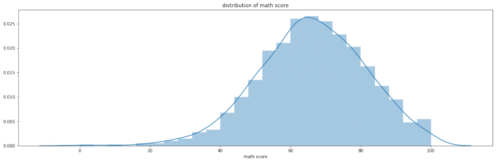
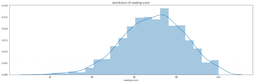
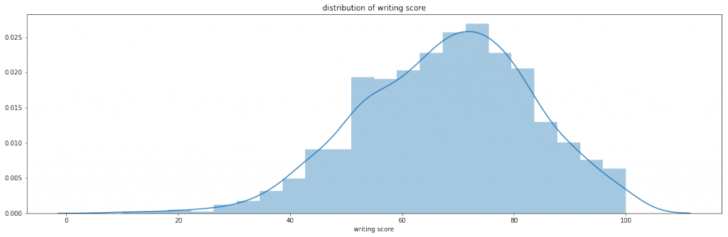
数学/Writing/Readingのテスト得点はどれも同じような分布をしているのがわかります。
次に、各テスト得点に相関があるのかをみてみます。
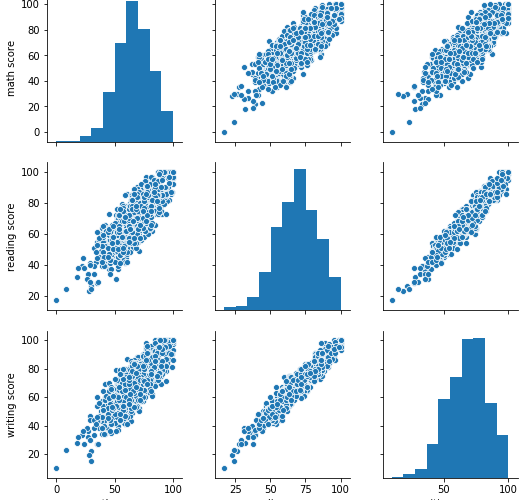
# ペアプロット
sns.pairplot(StudentsPerformance)
OUTPUT: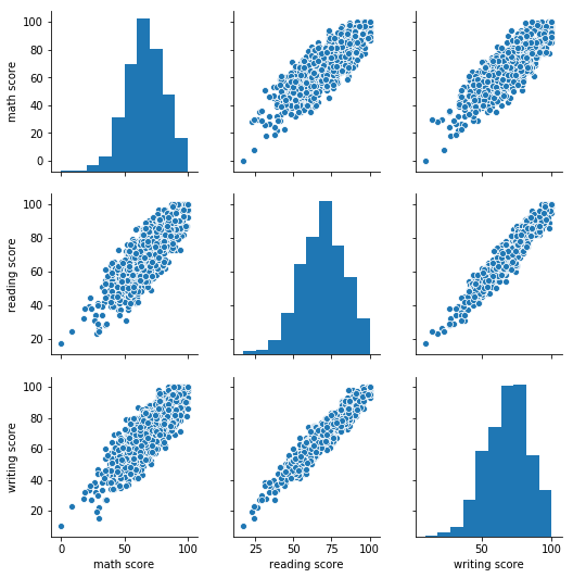
各テストの得点にはきれいな正の相関があるようにみえます。
相対的にみると、数学とWriting/Readingの相関は、とWritingとReadingの相関よりも弱そうです。
確かに、自分の学生の頃を振り返っても、数学はできるのに国語ができないとか、その逆のパターンなんかもよく見かけた覚えがあります。
(自分も数学は得意で国語が苦手な学生でしたし)
学生のプロフィール情報の分布
次に学生のプロフィール情報の分布をみてみます。
# カテゴリカラム
cat_col = [
    'gender'
    ,'race/ethnicity'
    ,'parental level of education'
    ,'lunch'
    ,'test preparation course'
]

cnt = 0
plt.figure(figsize=(20,10))
for col in cat_col:
    plt.subplot(2,3,cnt+1)
    sns.countplot(x=col, data=StudentsPerformance)
    plt.title('distribution of {}'.format(col))
    plt.xticks(rotation=45)
    cnt = cnt + 1
plt.tight_layout()
OUTPUT: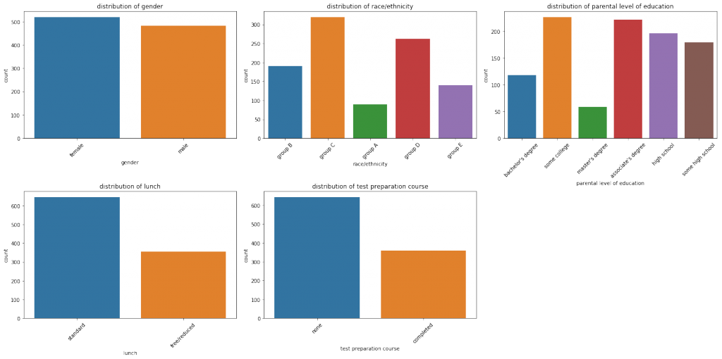
- gender(性別)
分布はほぼ同じようです。 - race/ethnicity(人種)
偏りがあります。ただ、「group」というラベルがついていて、具体的な名称は不明です。 - parental level of education(親の教育水準)
大学中退、短大卒、高卒、高校中退、学士卒、修士卒の順になっています。 - lunch(昼食)
標準が多く、なしor量が少ない人は少ないようです。 - test preparation course(テスト準備講座)
講座を受講していない人が多く、講座を受講した人は少ないようです。
テストの得点と学生のプロフィール情報の分布
次はテストの得点と学生のプロフィール情報を掛け合わせた分布をみてみます。
数学/Writing/Readingそれぞれ分けて可視化します。
for col_ in int_col:
    cnt = 0
    plt.figure(figsize=(20,10))
    for col in cat_col:
        plt.subplot(2,3,cnt+1)
        sns.boxplot(x=col,y=col_,data=StudentsPerformance)
        plt.xticks(rotation=45)
        cnt = cnt + 1
OUTPUT: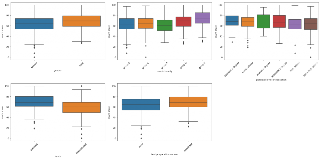
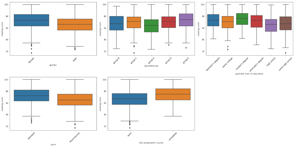
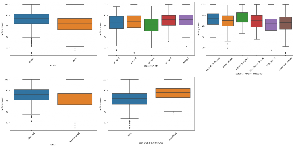
どの科目のテストにおいても以下のことがわかります。
- テスト講座を受講した方が得点が高い
- 標準的な昼食を取っている方が得点が高い
- 親が大卒の方が得点が高い
- 各科目における人種間の得点分布が似通っている
また、数学のテスト結果が女子よりも男子の方が高いということもわかります。
男子は論理思考型、女子は直感型思考とかよく言われているような気がします(これも何かで読んだ気がしますが、間違っていたらすいません)。
アンサンブル学習器を用いた各スコアに対する重要度の評価
最後にアンサンブル学習器の1つであるランダムフォレストの重要度を用いた特徴量の評価をしてみます。
# ランダムフォレスト回帰
rfr = RandomForestRegressor()
data = StudentsPerformance.copy()
# Label encoderのオブジェクトを入れるリスト
le_list = []
for col in cat_col:
    le = LabelEncoder()
    data[col] = le.fit_transform(data[col])
    le_list.append(le)

X = data[cat_col]

plt.figure(figsize=(20,10))
cnt = 0
# 当てはめ誤差
scores = []
for col in int_col:
    y = data[col]
    plt.subplot(3,1,cnt+1)
    rfr.fit(X,y)
    scores.append(rfr.score(X,y))
    sns.barplot(x=rfr.feature_importances_,y=np.array(cat_col))
    plt.title('importance for {}'.format(col))
    cnt = cnt + 1
print(scores)
OUTPUT: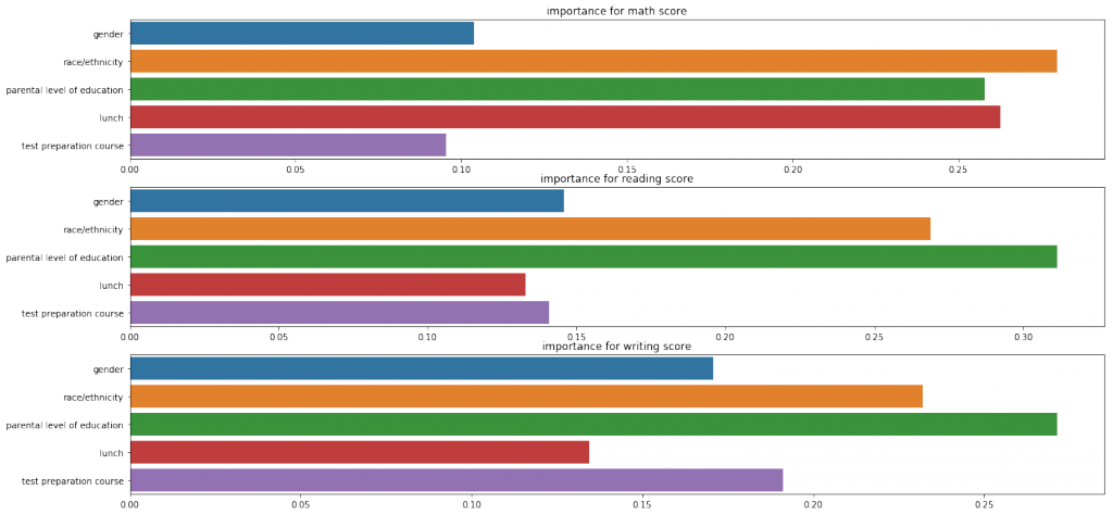
Writing/Readingは重要度の評価が似ていますが、数学はlanch(昼食)がかなり高く評価されている点で少し異なります。
カテゴリカル特徴量をダミー変換し、詳細な重要度をみてみましょう。
# 特徴量のOneHot特徴量を生成する
onehot_df = []
for col in cat_col:
    if len(onehot_df) == 0:
        onehot_df = pd.get_dummies(StudentsPerformance[col]).rename(columns=lambda x: col + '_' + x)
    onehot_df = pd.concat(
        [
            onehot_df
            ,pd.get_dummies(StudentsPerformance[col]).rename(columns=lambda x: col + '_' + x)
        ]
        ,axis=1
    )

# plt.figure(figsize=(20,80))
cnt = 0
# 当てはめ誤差
scores = []
for col in int_col:
    y = data[col]
    plt.figure(figsize=(20,30))
    plt.subplot(3,1,cnt+1)
    rfr.fit(onehot_df,y)
    scores.append(rfr.score(onehot_df,y))
    sns.barplot(x=rfr.feature_importances_,y=np.array(onehot_df.columns))
    plt.title('importance for {}'.format(col))
    cnt = cnt + 1
print(scores)
OUTPUT: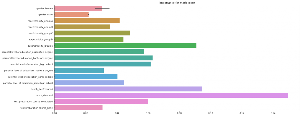
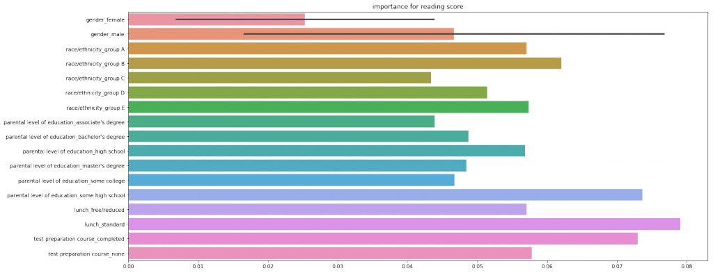
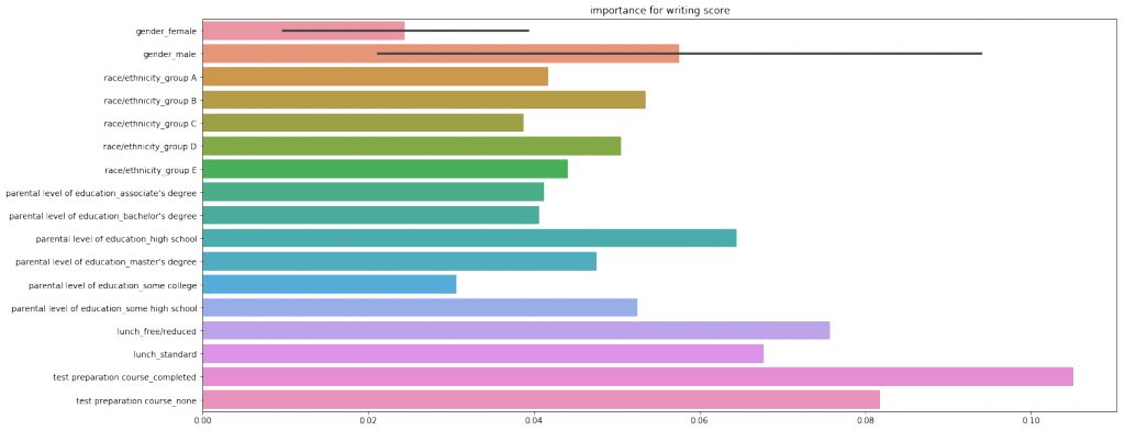
どの科目においてもlanch(昼食)がもっとも重要度が大きいと評価されました。
まとめ
仮説では教育環境や男女間の差がテスト得点と関連があるはずと考えていました。
しかし、結果からは意外にも、lanch(昼食)という特徴量がもっともテスト結果に関連がありそうなことがわかりました。
確かに、昼食の差は経済的な差とも言えるかも知れませんが、テスト結果とは直接的な関係が薄いように思います。
分析の仕方を間違った可能性が高いので、Kernelをみて再勉強します。。。
- 前の記事

時系列データに対する特徴量エンジニアリング手法のまとめ 2019.03.23
- 次の記事

『データは騙る: 改竄・捏造・不正を見抜く統計学』を読んだ感想 2019.05.12