レストランの来客数予測@Kaggle〜データ分析編①
- 2018.02.12
- Kaggle

3連休、もう終わりですね。
本来であればこの3連休は阿弥陀岳(南陵ルート)に挑む予定でした。
ですが、低気圧の通過で冬山としては最悪のコンディションが予想されたため延期になり、ぽっかりと連休の予定が空いてしまったのです。
ということで、この連休はKaggleのレストランの来客数予測をやっていました。
※準備編ということで、以前投稿したやつの続きです。

まずはお題となっているデータを個別にみていこうと思います。
(データの結合や、複数次元での分析をしません)
データの読み込み
統計解析言語Rを使って、データをみていきます。
まずは、お題となっているデータを読み込みます。
# データソースの読み込み
air_reserve <- read_csv("../input/air_reserve.csv")
air_store_info <- read_csv("../input/air_store_info.csv")
air_visit_data <- read_csv("../input/air_visit_data.csv")
date_info <- read_csv("../input/date_info.csv")
hpg_reserve <- read_csv("../input/hpg_reserve.csv")
hpg_store_info <- read_csv("../input/hpg_store_info.csv")
store_id_relation <- read_csv("../input/store_id_relation.csv")
※具体的にどんなデータなのかは、Kaggleに記載されています。

ざっくりというと、以下のデータとなっています。
| データセット(csv) | 説明 |
|---|---|
| air_reserve | Restaurant Boardから得られた予約・来店情報 |
| air_visit_data | AirREGIというクラウド型のレジから得られた来店客情報 |
| air_store_info | AirREGI/Restaurant Boardの店舗情報 |
| hpg_reserve | HOT PEPPERグルメの予約・来店情報 |
| hpg_store_info | HOT PEPPERグルメの店舗情報 |
| store_id_relation | AirREGI/Restaurant BoardとHOT PEPPERグルメの店舗情報の互換情報 |
| date_info | 休日などのカレンダー情報 |
次に、使用するパッケージを読み込みます。
# general visualisation
library('ggplot2') # visualisation
library('scales') # visualisation
library('grid') # visualisation
library('gridExtra') # visualisation
library('RColorBrewer') # visualisation
library('corrplot') # visualisation

# general data manipulation
library('dplyr') # data manipulation
library('readr') # input/output
library('data.table') # data manipulation
library('tibble') # data wrangling
library('tidyr') # data wrangling
library('stringr') # string manipulation
library('forcats') # factor manipulation

# specific visualisation
library('ggfortify') # visualisation
library('ggrepel') # visualisation
library('ggridges') # visualisation
library('ggExtra') # visualisation
library('ggforce') # visualisation
library('viridis') # visualisation

# specific data manipulation
library('lazyeval') # data wrangling
library('broom') # data wrangling
library('purrr') # string manipulation

# Date plus forecast
library('lubridate') # date and time
library('timeDate') # date and time
library('tseries') # time series analysis
library('prophet') # time series analysis

# Maps / geospatial
library('geosphere') # geospatial locations
library('leaflet') # maps
library('leaflet.extras') # maps
library('maps') # maps
また、1枚に複数のグラフを表示させるために、multiplot関数を外部スクリプトで定義します。
(通常、multiplot関数はggplot2パッケージに内包されるようです。しかし、今回はうまく動作しなかったためにわざわざ外部スクリプトで読み込んでいます。。)
# Multiple plot function
#
# ggplot objects can be passed in ..., or to plotlist (as a list of ggplot objects)
# - cols:   Number of columns in layout
# - layout: A matrix specifying the layout. If present, 'cols' is ignored.
#
# If the layout is something like matrix(c(1,2,3,3), nrow=2, byrow=TRUE),
# then plot 1 will go in the upper left, 2 will go in the upper right, and
# 3 will go all the way across the bottom.
#
multiplot <- function(..., plotlist=NULL, file, cols=1, layout=NULL) {
  library(grid)

  # Make a list from the ... arguments and plotlist
  plots <- c(list(...), plotlist)

  numPlots = length(plots)

  # If layout is NULL, then use 'cols' to determine layout
  if (is.null(layout)) {
    # Make the panel
    # ncol: Number of columns of plots
    # nrow: Number of rows needed, calculated from # of cols
    layout <- matrix(seq(1, cols * ceiling(numPlots/cols)),
                     ncol = cols, nrow = ceiling(numPlots/cols))
  }

  if (numPlots==1) {
    print(plots[[1]])

  } else {
    # Set up the page
    grid.newpage()
    pushViewport(viewport(layout = grid.layout(nrow(layout), ncol(layout))))

    # Make each plot, in the correct location
    for (i in 1:numPlots) {
      # Get the i,j matrix positions of the regions that contain this subplot
      matchidx <- as.data.frame(which(layout == i, arr.ind = TRUE))

      print(plots[[i]], vp = viewport(layout.pos.row = matchidx$row,
                                      layout.pos.col = matchidx$col))
    }
  }
}
上記で定義したrファイルを読み込み、関数として使えるようにします。
# 外部定義multiplot
source("multiplot.R")
AirREGIのデータ
まずはAirREGIシステムで収集されているレストランへの来客数の時系列トレンドを追ってみます。
p1 <- air_visit_data %>%
  group_by(visit_date) %>%
  summarise(all_visitors = sum(visitors)) %>%
  ggplot(aes(visit_date,all_visitors)) +
  geom_line(col = "blue") +
  labs(y = "All visitors", x = "Date")
plot(p1)
2016年7月で急激にトレンドがはね上がっています。
AirREGIへ新規登録があったということでしょうか。
(もちろんKaggleのお題となるデータはAirREGIの実データそのものではないので、主催者が意図的にコンペ用に取捨選択したデータとなっています。)
また、2016年12月あたりは来店数が急増しています。
これは忘年会シーズンによるものでしょう。
感覚的にもわかることですが、レストランへの来客数トレンドには周期性がありますね。
(金曜日は華金と言われていて飲み会が多いとか、週初めから飲み会があるとこは多くないとか)
なので、月別、曜日別のトレンドも見てみます。
p3 <- air_visit_data %>%
  # 曜日列を追加
  mutate(wday = wday(visit_date,label = TRUE)) %>%
  group_by(wday) %>%
  summarise(visits = median(visitors)) %>%
  ggplot(aes(wday, visits, fill = wday)) +
  geom_col() +
  theme(legend.position = "none", axis.text.x  = element_text(angle=45, hjust=1, vjust=0.9)) +
  # 日本語表記
  theme_gray(base_family = "HiraKakuPro-W3") +
  labs(x = "Day of the week", y = "Median visitors")

p4 <- air_visit_data %>%
  # 月列を追加
  mutate(month = month(visit_date, label = TRUE)) %>%
  group_by(month) %>%
  summarise(visits = median(visitors)) %>%
  ggplot(aes(month, visits, fill = month)) +
  geom_col() +
  theme(legend.position = "none") +
  labs(x = "Month", y = "Median visitors")

layout <- matrix(c(1,2),1,2,byrow=TRUE)
multiplot(p3, p4, layout=layout)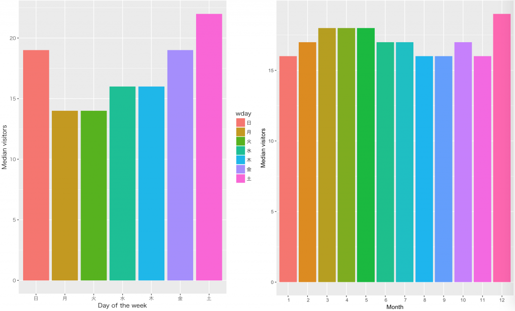
予想通り、金曜、週末は来客数が多く、月曜と火曜は来客数が減っています。
月別にみると忘年会シーズンの影響なのか、12月の来客数が多いですね。
また、3~5月の来客数も他の月に比べて多いです。
これは、歓送迎のシーズンによるものでしょう。
Restaurant BOARDのデータ
次に、Restaurant BOARDのデータをみてみましょう。
まずは、AirREGIのときと同様に、予約して来客した数の時系列トレンドを追います。
foo <- air_reserve %>%
  # 以下の列をair_reserveに新規追加
  # 予約詳細日時、予約時間、予約曜日
  # 訪問詳細日時、訪問時間、訪問曜日
  # リードタイム=予約詳細日時-訪問詳細日時
  mutate(reserve_date = date(reserve_datetime),
         reserve_hour = hour(reserve_datetime),
         reserve_wday = wday(reserve_datetime, label = TRUE),
         visit_date = date(visit_datetime),
         visit_hour = hour(visit_datetime),
         visit_wday = wday(visit_datetime, label = TRUE),
         diff_hour = time_length(visit_datetime - reserve_datetime, unit = "hour"),
         diff_day = time_length(visit_datetime - reserve_datetime, unit = "day")
  )

p1 <- foo %>%
  group_by(visit_date) %>%
  summarise(all_visitors = sum(reserve_visitors)) %>%
  ggplot(aes(visit_date, all_visitors)) +
  geom_line() +
  labs(x = "visit date",y = 'visitors after reservation')
plot(p1)
2016年は2017年に比べると、全体的に来客数が低いことがわかります。
AirREGIと同様に、登録店舗数などが関係あるのかもしれません。
また、2016年の年末にかけて急激に来客数が増加していて、2017年に入った後も来客数のベースは底上げされたまま維持されています。
忘年会シーズンは予約が殺到する繁忙期なので、このトレンドは感覚的にも理解できます。
一方で、2016年8月を過ぎたあたりから来客数が激減しています。(データが存在していない?)
今回の予測で必要な学習用データの期間は、少なくとも1Q(4月~6月)あれば十分でしょう。
学習に必要な期間以外のデータはこのデータセットにはないのかもしれませんね。
次に、時間別の予約後来客数をみてみましょう。
p2 <- foo %>%
  # 時間単位で集約
  group_by(visit_hour) %>%
  summarise(all_visitors = sum(reserve_visitors)) %>%
  ggplot(aes(visit_hour, all_visitors)) +
  geom_col(fill = "blue") +
  labs(x = "visit hour",y = 'visitors after reservation')
plot(p2)
11時〜12時(ランチ)と17時〜21時(ディナー)に分布の山が別れています。
特に、18時の予約後来客数が最も多いですね。
予約から来店までのリードタイム(時間)もみてみましょう。
p3 <- foo %>%
  # 予約から訪問までのリードタイムが10日以内
  filter(diff_hour < 24*10) %>%
  group_by(diff_hour) %>%
  summarise(all_visitors = sum(reserve_visitors)) %>%
  ggplot(aes(diff_hour, all_visitors)) +
  geom_col(fill = "blue") +
  labs(x = "Time from reservation to visit [hours]")
plot(p3)
横軸は予約から来店までの経過時間で、縦軸は来客数となります。
見事に24時間周期のパターンが現れています。
当日来店であれば来店の2、3時間前に予約するのが最も多く、翌日以降の来店であればおおよそ24時間単位で事前に予約していることがわかりますね。
- 前の記事

レストランの来客数予測@Kaggle〜準備編 2018.02.04
- 次の記事
無料BIツールTableau Public版を使った川崎市施設別WiFiアクセス数の可視化 2018.05.03